element-ui 因其组件丰富、可拓展性强、文档详细等优点成为 Vue 最火的第三方 UI 框架。element-ui 其本身就针对后台系统设计了很多实用的组件,基本上满足了平时的开发需求。
既然如此,那么我们为什么还要进行二次封装呢?
有以下两种场景
在日常的开发过程中,部分模块重复性比较强,这个时候就会产生大量重复的代码。这些模块的样式基本上是比较固定的,而且实现的功能也比较相近。如果每个地方都复制一份相似的代码,既不遵守代码的简洁之道,也不利于后期的维护修改
此外,在一些业务背景下,产品可能会要求设计新的交互。这个时候也可以基于 element-ui 进行二次开发,将其封装成一个新的组件方便多个地方使用
因为在日常开发过程中,项目主要以 Vue2 为主,并且现在很多公司仍在使用着 Vue2。故本文主要探讨 Vue2 + element-ui 的项目可以怎么封装一些比较通用化的组件
el-input-number 是一个很好用的组件,它只允许用户输入数字值。但是这个组件会有个默认值,给他赋予一个null 或""的时候会显示0
这对于有些业务来说并不是很友好,例如添加页面和编辑页面
并且它这个组件的值是居中显示的,和普通的input 框居左显示不同,这就导致了样式不太统一
改造:让 InputNumber 可以居左显示且没有默认值,用法保持和el-input-number组件相似
子组件 InputNumber.vue
<template> <el-input-number id="InputNumber" style="width: 100%" v-model="insideValue" v-bind="$attrs" :controls="controls" v-on="$listeners" /> </template> <script> export default { // 让父组件 v-model 传参 model: { prop: 'numberValue', event: 'change', }, props: { numberValue: { type: [Number, String], default: undefined, }, // 默认不显示控制按钮,这个可以根据实际情况做调整 controls: { type: Boolean, default: false, }, }, data () { return { insideValue: undefined, }; }, watch: { numberValue (newVlalue) { // 若传入一个数字就显示。为空则不显示 if (typeof newVlalue === 'number') { this.insideValue = newVlalue; } else this.insideValue = undefined; }, }, }; </script> <style lang="scss" scoped> #InputNumber { /deep/ .el-input__inner { text-align: left; } } </style> 父组件
<template> <InputNumber v-model="value" style="width: 200px" /> </template> <script> import InputNumber from './InputNumber'; export default { components: { InputNumber, }, data () { return { value: null, }; }, }; </script> 演示:

select 组件用在有较多选项时,但是有些选项的长度难免比较长,就会把选项框整个给撑大,例如:
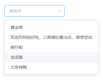
这种还是比较短的时候了,有时因为公司名称较长,或者其他业务要展示的字段过长时就不太友好。
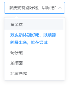
改造:固定选项框的大小,让选项显示更加合理
子组件 OptionPlus.vue
<template> <el-option :style="`width: ${width}px`" v-bind="$attrs" v-on="$listeners"> <slot /> </el-option> </template> <script> export default { props: { width: { type: Number, }, }, }; </script> <style lang="scss" scoped> .el-select-dropdown__item { min-height: 35px; height: auto; white-space: initial; overflow: hidden; text-overflow: initial; line-height: 25px; padding: 5px 20px; } </style> 父组件
<template> <el-select v-model="value" placeholder="请选择"> <OptionPlus v-for="item in options" :key="item.value" :label="item.label" :value="item.value" :width="200"> </OptionPlus> </el-select> </template> <script> import OptionPlus from './OptionPlus'; export default { components: { OptionPlus, }, data () { return { value: null, options: [{ value: '选项1', label: '黄金糕', }, { value: '选项2', label: '双皮奶特别好吃,以顺德的最出名,推荐尝试', }, { value: '选项3', label: '蚵仔煎', }, { value: '选项4', label: '龙须面', }, { value: '选项5', label: '北京烤鸭', }], }; }, }; 效果:
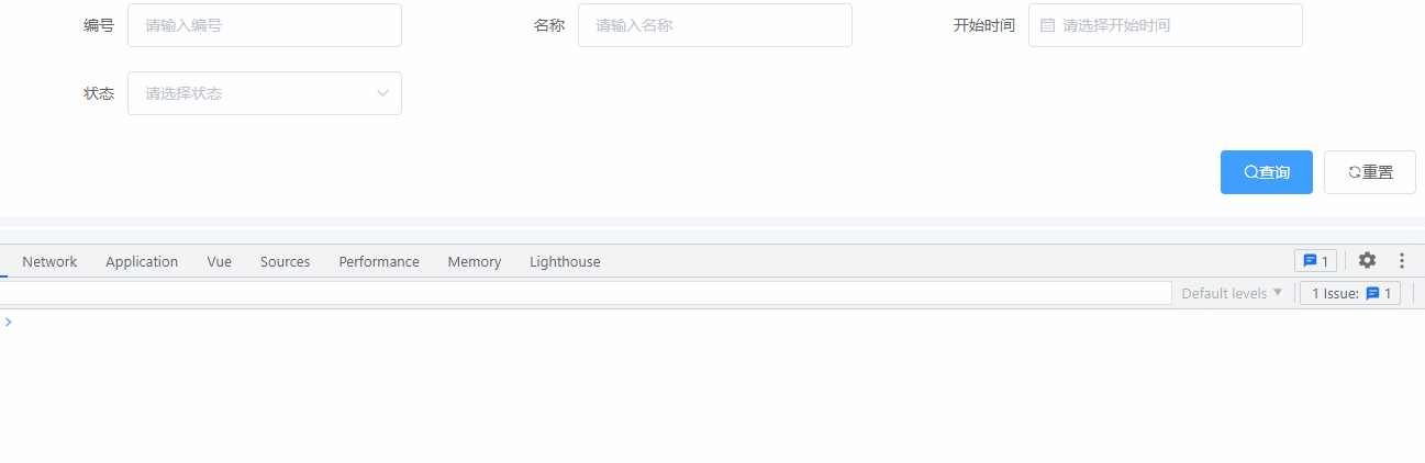
后台系统肯定会有查找功能,搜索条件大部分都是这三种,输入框、下拉框和日期选择。所以可以整合这三个常用的元素,将它们封装成一个易于使用的组件
这三个组件是用来过滤条件的,因此一般与查询和重置按钮在一起
子组件FormPlus.vue
<template> <div id="FormPlus"> <el-form ref="ruleForm" :rules="rules" :inline="inline" :model="ruleForm" class="ruleForm" :label-width="labelWidth" :style="formStyle"> <template v-for="(item, index) in list"> <template v-if="!item.type || item.type === 'input'"> <el-form-item :key="index" :label="item.label" :prop="item.model" :required="item.required"> <el-input v-model.trim="ruleForm[item.model]" :clearable="item.clearable === undefined || item.clearable" filterable :placeholder="item.placeholder" /> </el-form-item> </template> <template v-if="item.type === 'select'"> <el-form-item :key="index" :label="item.label" :prop="item.model" :required="item.required"> <el-select :style="`width: ${formItemContentWidth}`" v-model.trim="ruleForm[item.model]" :clearable="item.clearable === undefined || item.clearable" filterable :placeholder="item.placeholder || ''"> <!-- 使用上文提到的 OptionPlus 组件 --> <OptionPlus v-for="(i, key) in item.options" :key="i[item.optionsKey] || key" :label="i[item.optionsLabel] || i.label" :value="i[item.optionsValue] || i.value" :width="formItemContentWidth" /> </el-select> </el-form-item> </template> <template v-if="item.type === 'date-picker'"> <el-form-item :key="index" :prop="item.model" :label="item.label" :required="item.required"> <el-date-picker v-model.trim="ruleForm[item.model]" :clearable="item.clearable === undefined || item.clearable" :type="item.pickerType" :placeholder="item.placeholder" :format="item.format" :value-format="item.valueFormat" :picker-options="item.pickerOptions" /> </el-form-item> </template> </template> <slot /> </el-form> <el-row> <el-col class="btn-container"> <el-button class="el-icon-search" type="primary" @click="submitForm">查询</el-button> <el-button class="el-icon-refresh" @click="resetForm">重置</el-button> </el-col> </el-row> </div> </template> <script> import OptionPlus from './OptionPlus'; export default { components: { OptionPlus }, props: { list: { type: Array, default: () => [], }, inline: { type: Boolean, default: true, }, labelWidth: { type: String, default: '100px', }, formItemWidth: { type: String, default: '400px', }, formItemContentWidth: { type: String, default: '250px', }, rules: { type: Object, default: () => { }, }, }, data () { return { ruleForm: {}, }; }, computed: { formStyle () { return { '--formItemWidth': this.formItemWidth, '--formItemContentWidth': this.formItemContentWidth, }; }, }, watch: { list: { handler (list) { this.handleList(list); }, immediate: true, deep: true, }, }, methods: { // 所填写数据 submitForm () { this.$refs['ruleForm'].validate((valid) => { if (valid) { const exportData = { ...this.ruleForm }; this.$emit('submitForm', exportData); } else { return false; } }); }, // 默认清空所填写数据 resetForm () { this.$refs.ruleForm.resetFields(); this.handleList(this.list); this.$emit('resetForm'); }, handleList (list) { for (let i = 0; i < list.length; i++) { const formitem = list[i]; const { model } = formitem; this.$set(this.ruleForm, model, ''); } }, }, }; </script> <style lang="scss" scoped> #FormPlus { .ruleForm { width: 100%; ::v-deep.el-form-item { width: var(--formItemWidth); } ::v-deep.el-form-item__content { width: var(--formItemContentWidth); } ::v-deep.el-form-item__content .el-date-editor, .el-input { width: var(--formItemContentWidth); } } .btn-container { display: flex; justify-content: flex-end; margin-top: 10px; } } </style> 父组件
<template> <FormPlus :list="formList" @submitForm="searchPage" @resetForm="resetForm" /> </template> <script> import FormPlus from './FormPlus'; export default { components: { FormPlus, }, data () { return { formList: [ { label: '编号', model: 'applyNumber', placeholder: '请输入编号' }, { label: '名称', model: 'name', placeholder: '请输入名称' }, { type: 'date-picker', label: '开始时间', model: 'startTime', valueFormat: 'yyyy-MM-dd HH:mm:ss', placeholder: '请选择开始时间' }, { type: 'select', label: '状态', model: 'status', placeholder: '请选择状态', options: [] }, ], }; }, methods: { // 可以取到子组件传递过来的数据 searchPage (ruleForm) { console.log(ruleForm, 'ruleForm'); }, resetForm () { }, }, }; </script> 演示:
接口获取到的数据可以用this.formList[index] = res.data;来将数据塞进 el-select 的选项数组中
这个组件其实是有一定局限性的,如果确实有特别的需求还是要用 el-form 表单来写
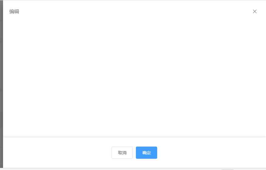
抽屉组件可以提供更深一级的操作,往往内容会比较多比较长。因此可以封装一个组件,让操作按钮固定在 drawer 底部,以实现较好的交互
子组件 DrawerPlus.vue
<template> <div id="drawerPlus"> <el-drawer v-bind="$attrs" v-on="$listeners"> <el-scrollbar class="scrollbar"> <slot /> <div class="seat"></div> <div class="footer"> <slot name="footer" /> </div> </el-scrollbar> </el-drawer> </div> </template> <style lang="scss" scoped> $height: 100px; #drawerPlus { .scrollbar { height: 100%; position: relative; .seat { height: $height; } .footer { z-index: 9; box-shadow: 0 -4px 6px rgba(0, 0, 0, 0.08); width: 100%; position: absolute; bottom: 0px; height: $height; background-color: #fff; display: flex; align-items: center; justify-content: center; } } } </style> 父组件
<template> <DrawerPlus title="编辑" :visible.sync="drawerVisible" direction="rtl" size="45%"> <template slot="footer"> <el-button @click="drawerVisible = false">取消</el-button> <el-button type="primary" @click="drawerVisible = false">确定</el-button> </template> </DrawerPlus> </template> <script> import DrawerPlus from './DrawerPlus'; export default { components: { DrawerPlus, }, data () { return { drawerVisible: false, }; }, }; </script> 效果:
使用 el-scrollbar 组件来实现更优雅的滚动效果,底部固定并增加一些阴影增加美观
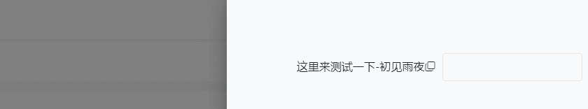
在日常开发中,有时可能想实现一键复制,我们可以选择手写复制方法,也可以选择引入 clipboard.js 库帮助快速实现功能
在笔者写过的一篇文章《在网站copy时自带的版权小尾巴以及“复制代码“,可以怎么实现 》,这篇文章中有提到怎么手写复制功能
当然,严格意义上来说,这个组件主要实现不是依赖 element-ui 的,但也有用到其中的一些组件,所以也写在这里
子组件 CopyIcon.vue
<template> <i :class="`${icon} icon-cursor`" title="点击复制" @click="handleCopy($event, text)" /> </template> <script> // 引入 clipboard.js import Clipboard from 'clipboard'; export default { props: { // 接收复制的内容 text: { type: [String, Number], default: null, }, // 默认是复制 icon,可自定义 icon icon: { type: [String], default: 'el-icon-copy-document', }, // 自定义成功提示 message: { type: [String, Number], default: null, }, }, methods: { handleCopy (e, _text, message) { const clipboard = new Clipboard(e.target, { text: () => _text }); const messageText = message || `复制成功:${_text}`; clipboard.on('success', () => { this.$message({ type: 'success', message: messageText }); clipboard.off('error'); clipboard.off('success'); clipboard.destroy(); }); clipboard.on('error', () => { this.$message({ type: 'warning', message: '复制失败,请手动复制' }); clipboard.off('error'); clipboard.off('success'); clipboard.destroy(); }); clipboard.onClick(e); }, }, }; </script> <style lang="scss" scoped> .icon-cursor { cursor: pointer; } </style> 父组件
<template> <div> <span>{{ value }}</span> <CopyIcon :text="value" /> </div> </template> <script> import CopyIcon from './CopyIcon'; export default { components: { CopyIcon, }, data () { return { value: '这里来测试一下-初见雨夜', }; }, }; </script> 演示:
二次封装虽说方便了后续的开发,但是当封装的组件不能满足需求时,可以考虑迭代或者用回 element-ui 原生的组件
因为笔者水平有限,对组件都是进行比较简单的封装,并且有些地方设计可能不是很合理,还请多多指教~
评论已关闭。