CSS 布局与视觉效果常用实践指南
在我一篇随笔中其实有说到十大布局,里面有提到 flex 布局、grid 布局、响应式布局,不过没有提到容器查询这个,现在说下这三个布局然后穿插下容器查询把。
1️⃣ 核心布局方案
🧩 Flexbox 弹性布局

适用场景:线性布局、动态内容对齐,例如按钮组、导航栏、商品卡片列表
.navbar { display: flex; justify-content: space-between; align-items: center; gap: 1.5rem; flex-wrap: wrap; @media (max-width: 768px) { flex-direction: column; } } 🔳 Grid 网格布局

适用场景:二维布局、复杂排列
📦 应用场景:日历打卡、微信服务页面九宫格布局
.calendar { display: grid; grid-template-columns: repeat(7, 1fr); gap: 8px; } .grid-menu { display: grid; grid-template-columns: repeat(3, 1fr); gap: 12px; } 📦 容器查询(Container Queries)


组件根据容器大小自适应,而非整个视口
📦 应用场景:嵌套组件(如卡片、图表容器)
.card-container { container-type: inline-size; container-name: card; } .card { @container card (width < 800px) { .desc { font-size: 12px; } } } 🖥 媒体查询(Media Queries)
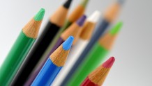
图片如上
适用场景:针对屏幕尺寸、设备类型进行响应式调整
📦 应用场景:整体页面布局、字体、间距适配
$breakpoints: ( desktop: 1200px, tablet: 768px, mobile: 480px, ); .card-container { display: grid; grid-template-columns: repeat(3, 1fr); gap: 1.5rem; padding: 2rem; @media (max-width: map-get($breakpoints, tablet)) { grid-template-columns: 1fr; padding: 1.5rem; } @media (max-width: map-get($breakpoints, mobile)) { padding: 1rem; } } 2️⃣ 高级视觉效果
🔮 玻璃拟态(Glassmorphism)

📦 应用场景:用户信息卡片、登录弹窗背景等
.glass-panel { background: linear-gradient( 135deg, rgba(255, 255, 255, 0.15) 0%, rgba(255, 255, 255, 0.05) 100% ); backdrop-filter: blur(12px) saturate(160%); border: 1px solid rgba(255, 255, 255, 0.2); border-radius: 16px; box-shadow: 0 8px 32px rgba(0, 0, 0, 0.1), inset 0 4px 12px rgba(255, 255, 255, 0.2); @supports not (backdrop-filter: blur()) { background: rgba(255, 255, 255, 0.9); } } 🌌 视差滚动(Parallax)
📦 应用场景:活动页背景、Banner 页面动效
<div class="parallax-container"> <div class="parallax-layer" data-speed="0.1"></div> <div class="parallax-layer" data-speed="0.3"></div> </div> .parallax-container { perspective: 1000px; height: 100vh; overflow-x: hidden; overflow-y: scroll; position: relative; } .parallax-layer { position: absolute; width: 100%; height: 200%; transform-style: preserve-3d; background-size: cover; } 3️⃣ 响应式设计策略
📱 自适应布局策略
优先使用弹性布局 + SCSS 嵌套媒体查询 + 相对单位
| 单位 | 适用场景 | 示例 |
|---|---|---|
| rem | 字体/边距 | font-size: 1.2rem |
| vw/vh | 视口宽高 | width: 100vw |
| % | 相对父元素 | width: 50% |
| ch | 文本宽度限制 | max-width: 60ch |
.container { --gutter: clamp(1rem, 3vw, 2rem); padding-inline: var(--gutter); max-width: 1440px; margin: 0 auto; @media (width < map-get($breakpoints, tablet)) { grid-template-columns: 1fr; } } 4️⃣ 实验性特性前瞻
⚗️ CSS Houdini 自定义绘制
📦 应用场景:粒子背景、按钮涟漪效果、可控图案
// 加载模块 CSS.paintWorklet.addModule('circle-painter.js'); // 使用样式 .element { background-image: paint(circlePainter); --circle-color: #ff4757; --circle-size: 8; } // circle-painter.js registerPaint( "circlePainter", class { static get inputProperties() { return ["--circle-color", "--circle-size"]; } paint(ctx, size, props) { const count = parseInt(props.get("--circle-size")); const color = props.get("--circle-color").toString(); ctx.fillStyle = color; for (let i = 0; i < count; i++) { ctx.beginPath(); ctx.arc( Math.random() * size.width, Math.random() * size.height, 4, 0, 2 * Math.PI ); ctx.fill(); } } } ); 5️⃣ 最佳实践总结
✅ 推荐方案
- 布局策略:Flexbox / Grid → 容器查询 → 媒体查询
- 单位选择:rem / vw → % → 固定 px(仅特殊场景)
- 视觉效果:渐进增强,提供降级处理
- 代码维护:SCSS 嵌套 + 设计变量系统 + CSS 变量
❌ 避免事项
- ❗ 过度使用
!important - 🧱 超过 3 层的选择器嵌套
- 📏 固定宽高组合使用(不利响应)
- 🌀 重复定义断点逻辑