
🚀前言
焦点事件是指程序中的重要事件或关键点。焦点事件通常是程序的核心逻辑和功能,需要引起特殊的关注和处理。
在图形用户界面(GUI)编程中,焦点事件通常与用户交互和界面输入相关。例如,当用户点击按钮、输入文本或选择菜单项时,这些操作会触发相应的焦点事件。程序需要捕获这些焦点事件并进行处理,以执行相应的操作或响应用户的请求。
另外,在事件驱动的编程模型中,焦点事件也与程序的流程控制和状态转换有关。例如,当某个关键条件满足时,程序会触发相应的焦点事件,然后根据这些事件来执行特定的操作或改变程序的状态。
🚀一、焦点事件
🔎1.基本概念
焦点事件基本概念是指在用户界面中,焦点在不同控件之间切换时,触发的相关事件。下面是一些焦点事件的基本概念:
-
焦点(Focus):焦点是指用户当前正在与之交互的控件或元素。例如,在一个表单中,焦点可能位于输入框、复选框或按钮等控件上。焦点通常用来表示哪个控件可以接收用户的输入。
-
默认焦点(Default Focus):默认焦点是指用户在进入一个界面或打开一个应用程序时,自动设置在界面中某个控件上的焦点。默认焦点通常是用来提高用户交互的效率,使用户可以直接开始输入或选择操作。
-
获焦(Focus Gained):获焦是指当一个控件或元素成为焦点时触发的事件。获焦事件通常可以用来执行一些初始化操作,例如设置焦点控件的样式或加载数据。
-
失焦(Focus Lost):失焦是指当一个控件或元素不再是焦点时触发的事件。失焦事件通常可以用来执行一些清理操作,例如保存用户输入或验证输入数据。
-
走焦(Traversal):走焦是指焦点在控件之间切换的过程。焦点可以通过按下Tab键或者使用方向键来在不同的控件之间移动。
-
焦点态(Focus State):焦点态是指控件或元素在成为焦点或失去焦点时,其外观或状态发生的变化。焦点态可以用来提高用户交互的可见性,例如高亮显示焦点控件或显示输入光标。
焦点事件基本概念涉及到焦点的获取、失去和切换,以及与焦点相关的事件和状态。
🔎2.走焦规则


🔎3.监听组件的焦点变化
接口定义:
onFocus(event: () => void)//获焦事件回调 onBlur(event:() => void)//失焦事件回调 案例:
// xxx.ets @Entry @Component struct FocusEventExample { @State oneButtonColor: Color = Color.Gray; @State twoButtonColor: Color = Color.Gray; @State threeButtonColor: Color = Color.Gray; build() { Column({ space: 20 }) { // 通过外接键盘的上下键可以让焦点在三个按钮间移动,按钮获焦时颜色变化,失焦时变回原背景色 Button('First Button') .width(260) .height(70) .backgroundColor(this.oneButtonColor) .fontColor(Color.Black) // 监听第一个组件的获焦事件,获焦后改变颜色 .onFocus(() => { this.oneButtonColor = Color.Green; }) // 监听第一个组件的失焦事件,失焦后改变颜色 .onBlur(() => { this.oneButtonColor = Color.Gray; }) Button('Second Button') .width(260) .height(70) .backgroundColor(this.twoButtonColor) .fontColor(Color.Black) // 监听第二个组件的获焦事件,获焦后改变颜色 .onFocus(() => { this.twoButtonColor = Color.Green; }) // 监听第二个组件的失焦事件,失焦后改变颜色 .onBlur(() => { this.twoButtonColor = Color.Grey; }) Button('Third Button') .width(260) .height(70) .backgroundColor(this.threeButtonColor) .fontColor(Color.Black) // 监听第三个组件的获焦事件,获焦后改变颜色 .onFocus(() => { this.threeButtonColor = Color.Green; }) // 监听第三个组件的失焦事件,失焦后改变颜色 .onBlur(() => { this.threeButtonColor = Color.Gray ; }) }.width('100%').margin({ top: 20 }) } }

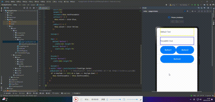
🔎4.设置组件是否获焦
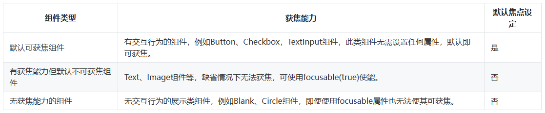
按照组件的获焦能力分为三类的表格展示,可以根据需要选择适合的组件类型来实现焦点控制功能。
接口:
focusable(value: boolean) 案例:
// xxx.ets @Entry @Component struct FocusableExample { @State textFocusable: boolean = true; @State color1: Color = Color.Yellow; @State color2: Color = Color.Yellow; build() { Column({ space: 5 }) { Text('Default Text') // 第一个Text组件未设置focusable属性,默认不可获焦 .borderColor(this.color1) .borderWidth(2) .width(300) .height(70) .onFocus(() => { this.color1 = Color.Blue; }) .onBlur(() => { this.color1 = Color.Yellow; }) Divider() Text('focusable: ' + this.textFocusable) // 第二个Text设置了focusable属性,初始值为true .borderColor(this.color2) .borderWidth(2) .width(300) .height(70) .focusable(this.textFocusable) .onFocus(() => { this.color2 = Color.Blue; }) .onBlur(() => { this.color2 = Color.Yellow; }) Divider() Row() { Button('Button1') .width(140).height(70) Button('Button2') .width(160).height(70) } Divider() Button('Button3') .width(300).height(70) Divider() }.width('100%').justifyContent(FlexAlign.Center) .onKeyEvent((e) => { // 绑定onKeyEvent,在该Column组件获焦时,按下'F'键,可将第二个Text的focusable置反 if (e.keyCode === 2022 && e.type === KeyType.Down) { this.textFocusable = !this.textFocusable; } }) } }
🔎5.自定义默认焦点
接口:
defaultFocus(value: boolean) 案例:
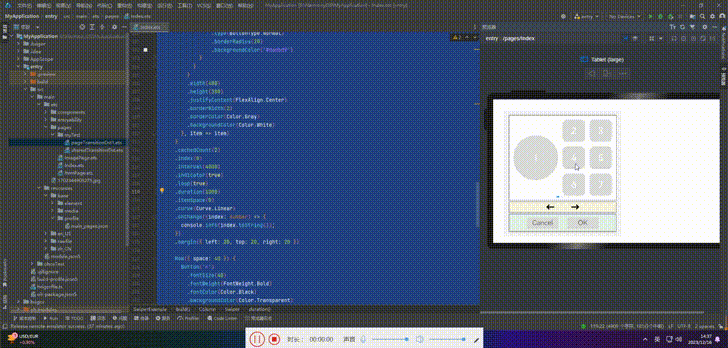
// xxx.ets import promptAction from '@ohos.promptAction'; class MyDataSource implements IDataSource { private list: number[] = []; private listener: DataChangeListener; constructor(list: number[]) { this.list = list; } totalCount(): number { return this.list.length; } getData(index: number): any { return this.list[index]; } registerDataChangeListener(listener: DataChangeListener): void { this.listener = listener; } unregisterDataChangeListener() { } } @Entry @Component struct SwiperExample { private swiperController: SwiperController = new SwiperController() private data: MyDataSource = new MyDataSource([]) aboutToAppear(): void { let list = [] for (let i = 1; i <= 4; i++) { list.push(i.toString()); } this.data = new MyDataSource(list); } build() { Column({ space: 5 }) { Swiper(this.swiperController) { LazyForEach(this.data, (item: string) => { Row({ space: 20 }) { Column() { Button('1').width(200).height(200) .fontSize(40) .backgroundColor('#dadbd9') } Column({ space: 20 }) { Row({ space: 20 }) { Button('2') .width(100) .height(100) .fontSize(40) .type(ButtonType.Normal) .borderRadius(20) .backgroundColor('#dadbd9') Button('3') .width(100) .height(100) .fontSize(40) .type(ButtonType.Normal) .borderRadius(20) .backgroundColor('#dadbd9') } Row({ space: 20 }) { Button('4') .width(100) .height(100) .fontSize(40) .type(ButtonType.Normal) .borderRadius(20) .backgroundColor('#dadbd9') Button('5') .width(100) .height(100) .fontSize(40) .type(ButtonType.Normal) .borderRadius(20) .backgroundColor('#dadbd9') } Row({ space: 20 }) { Button('6') .width(100) .height(100) .fontSize(40) .type(ButtonType.Normal) .borderRadius(20) .backgroundColor('#dadbd9') Button('7') .width(100) .height(100) .fontSize(40) .type(ButtonType.Normal) .borderRadius(20) .backgroundColor('#dadbd9') } } } .width(480) .height(380) .justifyContent(FlexAlign.Center) .borderWidth(2) .borderColor(Color.Gray) .backgroundColor(Color.White) }, item => item) } .cachedCount(2) .index(0) .interval(4000) .indicator(true) .loop(true) .duration(1000) .itemSpace(0) .curve(Curve.Linear) .onChange((index: number) => { console.info(index.toString()); }) .margin({ left: 20, top: 20, right: 20 }) Row({ space: 40 }) { Button('←') .fontSize(40) .fontWeight(FontWeight.Bold) .fontColor(Color.Black) .backgroundColor(Color.Transparent) .onClick(() => { this.swiperController.showPrevious(); }) Button('→') .fontSize(40) .fontWeight(FontWeight.Bold) .fontColor(Color.Black) .backgroundColor(Color.Transparent) .onClick(() => { this.swiperController.showNext(); }) } .width(480) .height(50) .justifyContent(FlexAlign.Center) .borderWidth(2) .borderColor(Color.Gray) .backgroundColor('#f7f6dc') Row({ space: 40 }) { Button('Cancel') .fontSize(30) .fontColor('#787878') .type(ButtonType.Normal) .width(140) .height(50) .backgroundColor('#dadbd9') Button('OK') .fontSize(30) .fontColor('#787878') .type(ButtonType.Normal) .width(140) .height(50) .backgroundColor('#dadbd9') .onClick(() => { promptAction.showToast({ message: 'Button OK on clicked' }); }) } .width(480) .height(80) .justifyContent(FlexAlign.Center) .borderWidth(2) .borderColor(Color.Gray) .backgroundColor('#dff2e4') .margin({ left: 20, bottom: 20, right: 20 }) }.backgroundColor('#f2f2f2') .margin({ left: 50, top: 50, right: 20 }) } }
🔎6.自定义TAB键走焦顺序
Button('1').width(200).height(200) .fontSize(40) .backgroundColor('#dadbd9') .tabIndex(1) // Button-1设置为第一个tabIndex节点 Button('←') .fontSize(40) .fontWeight(FontWeight.Bold) .fontColor(Color.Black) .backgroundColor(Color.Transparent) .onClick(() => { this.swiperController.showPrevious(); }) .tabIndex(2) // Button-左箭头设置为第二个tabIndex节点 Button('OK') .fontSize(30) .fontColor('#787878') .type(ButtonType.Normal) .width(140).height(50).backgroundColor('#dadbd9') .onClick(() => { promptAction.showToast({ message: 'Button OK on clicked' }); }) .tabIndex(3) // Button-OK设置为第三个tabIndex节点 🦋6.1 groupDefaultFocus
我们分别将某个组件设置为tabIndex节点,设置完之后,只有当我们按下TAB/ShiftTab键在这3个组件上进行焦点切换时,才会出现快速走焦的效果。
为了解决这个问题,我们可以给每个区域的容器设置tabIndex属性。然而,这样设置存在一个问题:当首次走焦到容器上时,焦点会默认落在容器内的第一个可获焦组件上,而不是我们想要的Button1、左箭头、ButtonOK。
为了解决这个问题,我们引入了一个名为groupDefaultFocus的通用属性,该属性接受一个布尔值参数,默认值为false。使用该属性需要与tabIndex属性结合使用,首先使用tabIndex为每个区域(容器)定义焦点切换顺序,然后为Button1、左箭头、ButtonOK这些组件绑定groupDefaultFocus(true)。这样,在首次走焦到目标区域(容器)时,拥有groupDefaultFocus(true)绑定的子组件将同时获取焦点。
// xxx.ets import promptAction from '@ohos.promptAction'; class MyDataSource implements IDataSource { private list: number[] = []; private listener: DataChangeListener; constructor(list: number[]) { this.list = list; } totalCount(): number { return this.list.length; } getData(index: number): any { return this.list[index]; } registerDataChangeListener(listener: DataChangeListener): void { this.listener = listener; } unregisterDataChangeListener() { } } @Entry @Component struct SwiperExample { private swiperController: SwiperController = new SwiperController() private data: MyDataSource = new MyDataSource([]) aboutToAppear(): void { let list = [] for (let i = 1; i <= 4; i++) { list.push(i.toString()); } this.data = new MyDataSource(list); } build() { Column({ space: 5 }) { Swiper(this.swiperController) { LazyForEach(this.data, (item: string) => { Row({ space: 20 }) { // 设置该Row组件为tabIndex的第一个节点 Column() { Button('1').width(200).height(200) .fontSize(40) .backgroundColor('#dadbd9') .groupDefaultFocus(true) // 设置Button-1为第一个tabIndex的默认焦点 } Column({ space: 20 }) { Row({ space: 20 }) { Button('2') .width(100) .height(100) .fontSize(40) .type(ButtonType.Normal) .borderRadius(20) .backgroundColor('#dadbd9') Button('3') .width(100) .height(100) .fontSize(40) .type(ButtonType.Normal) .borderRadius(20) .backgroundColor('#dadbd9') } Row({ space: 20 }) { Button('4') .width(100) .height(100) .fontSize(40) .type(ButtonType.Normal) .borderRadius(20) .backgroundColor('#dadbd9') Button('5') .width(100) .height(100) .fontSize(40) .type(ButtonType.Normal) .borderRadius(20) .backgroundColor('#dadbd9') } Row({ space: 20 }) { Button('6') .width(100) .height(100) .fontSize(40) .type(ButtonType.Normal) .borderRadius(20) .backgroundColor('#dadbd9') Button('7') .width(100) .height(100) .fontSize(40) .type(ButtonType.Normal) .borderRadius(20) .backgroundColor('#dadbd9') } } } .width(480) .height(380) .justifyContent(FlexAlign.Center) .borderWidth(2) .borderColor(Color.Gray) .backgroundColor(Color.White) .tabIndex(1) }, item => item) } .cachedCount(2) .index(0) .interval(4000) .indicator(true) .loop(true) .duration(1000) .itemSpace(0) .curve(Curve.Linear) .onChange((index: number) => { console.info(index.toString()); }) .margin({ left: 20, top: 20, right: 20 }) Row({ space: 40 }) { // 设置该Row组件为第二个tabIndex节点 Button('←') .fontSize(40) .fontWeight(FontWeight.Bold) .fontColor(Color.Black) .backgroundColor(Color.Transparent) .onClick(() => { this.swiperController.showPrevious(); }) .groupDefaultFocus(true) // 设置Button-左箭头为第二个tabIndex节点的默认焦点 Button('→') .fontSize(40) .fontWeight(FontWeight.Bold) .fontColor(Color.Black) .backgroundColor(Color.Transparent) .onClick(() => { this.swiperController.showNext(); }) } .width(480) .height(50) .justifyContent(FlexAlign.Center) .borderWidth(2) .borderColor(Color.Gray) .backgroundColor('#f7f6dc') .tabIndex(2) Row({ space: 40 }) { // 设置该Row组件为第三个tabIndex节点 Button('Cancel') .fontSize(30) .fontColor('#787878') .type(ButtonType.Normal) .width(140) .height(50) .backgroundColor('#dadbd9') Button('OK') .fontSize(30) .fontColor('#787878') .type(ButtonType.Normal) .width(140) .height(50) .backgroundColor('#dadbd9') .defaultFocus(true) .onClick(() => { promptAction.showToast({ message: 'Button OK on clicked' }); }) .groupDefaultFocus(true) // 设置Button-OK为第三个tabIndex节点的默认焦点 } .width(480) .height(80) .justifyContent(FlexAlign.Center) .borderWidth(2) .borderColor(Color.Gray) .backgroundColor('#dff2e4') .margin({ left: 20, bottom: 20, right: 20 }) .tabIndex(3) }.backgroundColor('#f2f2f2') .margin({ left: 50, top: 50, right: 20 }) } } 🦋6.2 focusOnTouch
接口:
focusOnTouch(value: boolean) 点击是指使用触屏或鼠标左键进行单击,默认为false的组件,例如Button,不绑定该API时,点击Button不会使其获焦,当给Button绑定focusOnTouch(true)时,点击Button会使Button立即获得焦点。
案例:
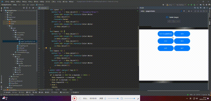
// requestFocus.ets import promptAction from '@ohos.promptAction'; @Entry @Component struct RequestFocusExample { @State idList: string[] = ['A', 'B', 'C', 'D', 'E', 'F', 'N'] build() { Column({ space:20 }){ Button("id: " + this.idList[0] + " focusOnTouch(true) + focusable(false)") .width(400).height(70).fontColor(Color.White).focusOnTouch(true) .focusable(false) Button("id: " + this.idList[1] + " default") .width(400).height(70).fontColor(Color.White) Button("id: " + this.idList[2] + " focusOnTouch(false)") .width(400).height(70).fontColor(Color.White).focusOnTouch(false) Button("id: " + this.idList[3] + " focusOnTouch(true)") .width(400).height(70).fontColor(Color.White).focusOnTouch(true) }.width('100%').margin({ top:20 }) } } 🦋6.3 focusControl.requestFocus
在任意执行语句中调用该API,指定目标组件的id为方法参数,当程序执行到该语句时,会立即给指定的目标组件申请焦点。
接口:
focusControl.requestFocus(id: string) 案例:
// requestFocus.ets import promptAction from '@ohos.promptAction'; @Entry @Component struct RequestFocusExample { @State idList: string[] = ['A', 'B', 'C', 'D', 'E', 'F', 'N'] @State requestId: number = 0 build() { Column({ space:20 }){ Row({space: 5}) { Button("id: " + this.idList[0] + " focusable(false)") .width(200).height(70).fontColor(Color.White) .id(this.idList[0]) .focusable(false) Button("id: " + this.idList[1]) .width(200).height(70).fontColor(Color.White) .id(this.idList[1]) } Row({space: 5}) { Button("id: " + this.idList[2]) .width(200).height(70).fontColor(Color.White) .id(this.idList[2]) Button("id: " + this.idList[3]) .width(200).height(70).fontColor(Color.White) .id(this.idList[3]) } Row({space: 5}) { Button("id: " + this.idList[4]) .width(200).height(70).fontColor(Color.White) .id(this.idList[4]) Button("id: " + this.idList[5]) .width(200).height(70).fontColor(Color.White) .id(this.idList[5]) } }.width('100%').margin({ top:20 }) .onKeyEvent((e) => { if (e.keyCode >= 2017 && e.keyCode <= 2022) { this.requestId = e.keyCode - 2017; } else if (e.keyCode === 2030) { this.requestId = 6; } else { return; } if (e.type !== KeyType.Down) { return; } let res = focusControl.requestFocus(this.idList[this.requestId]); if (res) { promptAction.showToast({message: 'Request success'}); } else { promptAction.showToast({message: 'Request failed'}); } }) } } 依次按下 TAB、A、B、C、D、E、F、N
🚀写在最后
- 如果你觉得这篇内容对你还蛮有帮助,我想邀请你帮我三个小忙:
- 点赞,转发,有你们的 『点赞和评论』,才是我创造的动力。
- 关注小编,同时可以期待后续文章ing🚀,不定期分享原创知识。
- 更多鸿蒙最新技术知识点,请关注作者博客:https://t.doruo.cn/14DjR1rEY


![洛谷 P11345 [KTSC 2023 R2] 基地简化 题解](http://www.itfaba.com/wp-content/themes/kemi/timthumb.php?src=http://www.itfaba.com/wp-content/themes/kemi/img/random/3.jpg&w=218&h=124&zc=1)
